Using toned canvas vs. white canvas
There are a lot of opinions about using toned canvas vs. white canvas. I personally have found that I prefer a toned canvas, but I like to reserve the right to use a white canvas if the time, place and medium require it. The main reason I would use a white canvas is I can use the white as the base for my light values or to maintain much of the translucency and vibrancy of transparent paints then paint much like a watercolor, light to dark. This is another of those subjective subjects, and it will boil down to your personal aesthetic and how you want to capture the scene. So, try something new and see if it works for you.
Here is why I like to use a toned canvas.
First of all, most canvases need an extra layer of gesso anyway, this is when I prefer to tint. I will add a little acrylic paint to the gesso. I use a dark pigment so when it mixes with the gesso it will leave a nice mid-tone value. One of my favorites is a craft store acrylic called Midnight Blue, it makes a nice cool blue-grey tone.
Second, having toned canvas covers all the white. This is nice because sometimes a missed spot of canvas will get confused with a highlight if the canvas is still white. Also, there may be a popcorn effect where the texture of the white canvas shows through. Both of these can make a painting look unfinished.
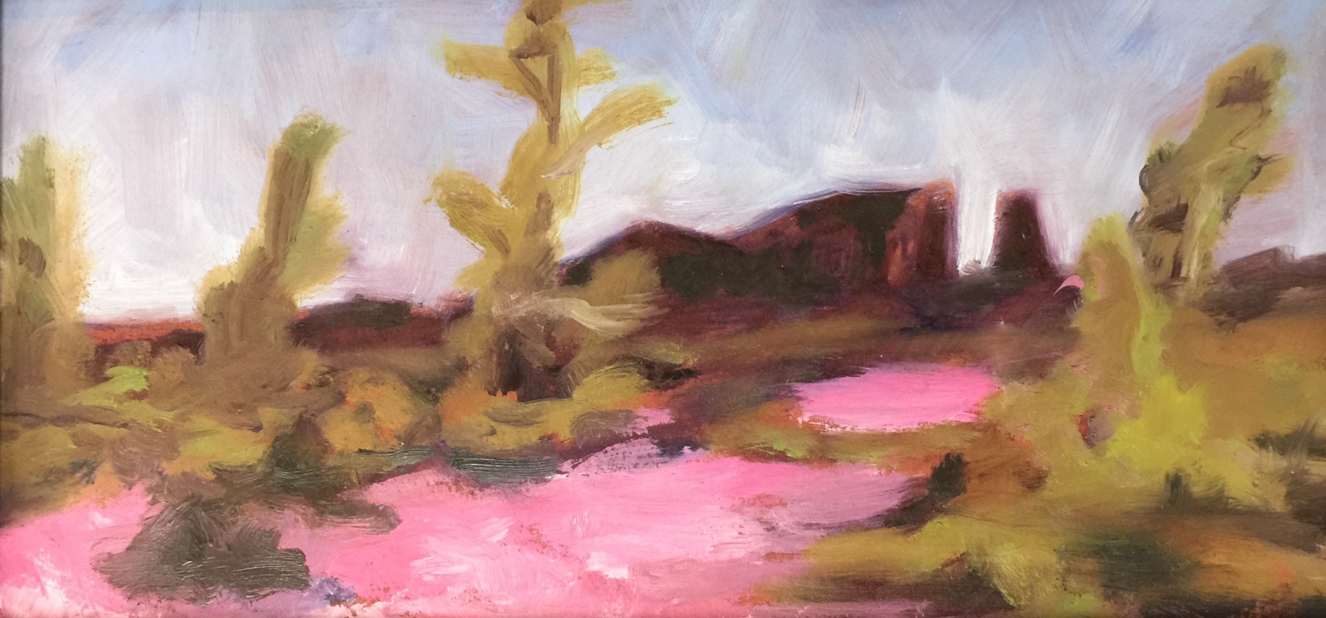
And, finally, a toned canvas can create an underlying ground which can create a mood or feeling or better convey a time of day for the painting. Take a look at my plein air sketch "Flowers on the Moon" from our 2018 Plein Air in the Parks retreat to Craters of the Moon (shown here). I've used a salmon-pink to tone the panel to add warmth to this warm spring day painting. The under tone can be complementary to the painting creating harmony, or contrasting for a sense of richness, or even a multiple color background to do both. I love that a toned canvas gives me one more opportunity to adjust color as part of the overall composition.
Some of the “safe” tones are burnt umber or raw sienna, having a little earth tone peek out can be a very nice addition to a landscape painting. However, I have had a lot of fun with under tones of more intense colors like yellow, orange, and even pink. Ultimately the only way to know if you are going to like it is to do it. We tend to learn more as we get out of our comfort zone, so, be brave and have fun experimenting.
